Behind the Scenes of the Superfluid IBC Redesign - Part II
Last week, we showed you which steps we had to take to re-design our Intelligent Business Cloud: From adjusting the color palette to creating a whole new visual language. This week we will continue with the user interface and how we coordinated this undertaking internally and externally.
Step 3: Re-design UI Elements
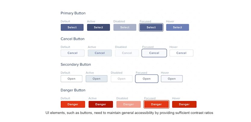
Re-designing mostly means applying new colors, checking contrasts, and trying out elements in different contexts, while maintaining both usability and the spirit of the brand. We pointed out before that especially for user interface components like buttons and menus, affordance and accessibility are essential.

UI elements, such as buttons, need to maintain general accessibility by providing sufficient contrast ratios
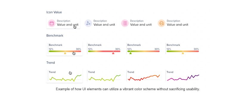
This, however, leaves room to be more creative with icons or data visualizations like line charts, for example. Despite branding efforts, it is very important to keep in mind the psychological effects of colors and to avoid chart junk (visual elements in data visualization that are not necessary to comprehend the information represented in the graph). In the case of the Icon + Value component (a UI Pattern we commonly use, see picture below), we decided to use weakened colors in the background and to avoid the colors red or green, unless the value has a highly negative or positive meaning.

Example of how UI elements can utilize a vibrant color scheme without sacrificing usability.
Step 4: Internal communication and QA
Why does a redesign need careful internal communication?
On the one hand, our scrum teams are capable of autonomously deploying their solutions whenever needed. That not only allows maximum flexibility when it comes to updates and hotfixes, but it also requires a lot of coordination when rolling out a major redesign like this one.
On the other hand, the teams largely make their own product decisions. While they are using a common design system to ensure a high level of consistency, they have a lot of freedom in their design choices.
However, a redesign on this scale requires a central decision making on certain design questions, that globally affect all of our products. Therefore an early alignment of all internal stakeholders was necessary: especially Product Managers, UX Designers, and Frontend Developers, but also Product Marketing and Brand.
What impact will the release have on our usual release cycle?
Which UI patterns are going to be newly introduced or deprecated?
What changes have to be made on the front end?
For example, it turned out to be invaluable to include frontend from the beginning, as many ideas could only be properly validated in a live prototype.
On the other side, product managers needed to coordinate their release efforts in order to ensure that all parts of the IBC reflect the update at once.
Updating each part individually over the course of weeks was simply not acceptable, as it would mean that some parts of the IBC would have an entirely different look and feel. The Quality Assurance team had to make sure that no leftovers of the old designs are to be found, and that everything still worked as expected.
Step 5: External communication
Last, but certainly not least, the changes have to be communicated to our customers and users. The worst thing that could happen to the unsuspecting business users, who log in to complete their daily tasks, would be a complete change of design and layout, without indication of what changed. This would directly invert our goal of great usability.
To avoid that, we did not change layouts with the first iteration, but only the visual appearance in order to minimize that painful change.
For our What’s Coming?-Guide (which typically appears when you log in the first time after an update) we developed a before/after slider to give you a direct comparison of the changes.

Our What’s Coming? Guide
Perhaps, you have also already received an email from our Marketing department announcing the changes.
We are excited to see the new, superfluid IBC in action and are looking forward to hearing your feedback!


