
Previous article
Picking Colors for Effective Data Visualizations with Brand Identity in Mind

When it comes to making charts, scales, and explaining data visually, using color is a very effective tool. Use it right, and you can not only draw your readers in, but you can help them better understand the underlying data.
— Alan Wilson, Principal Designer, Adobe
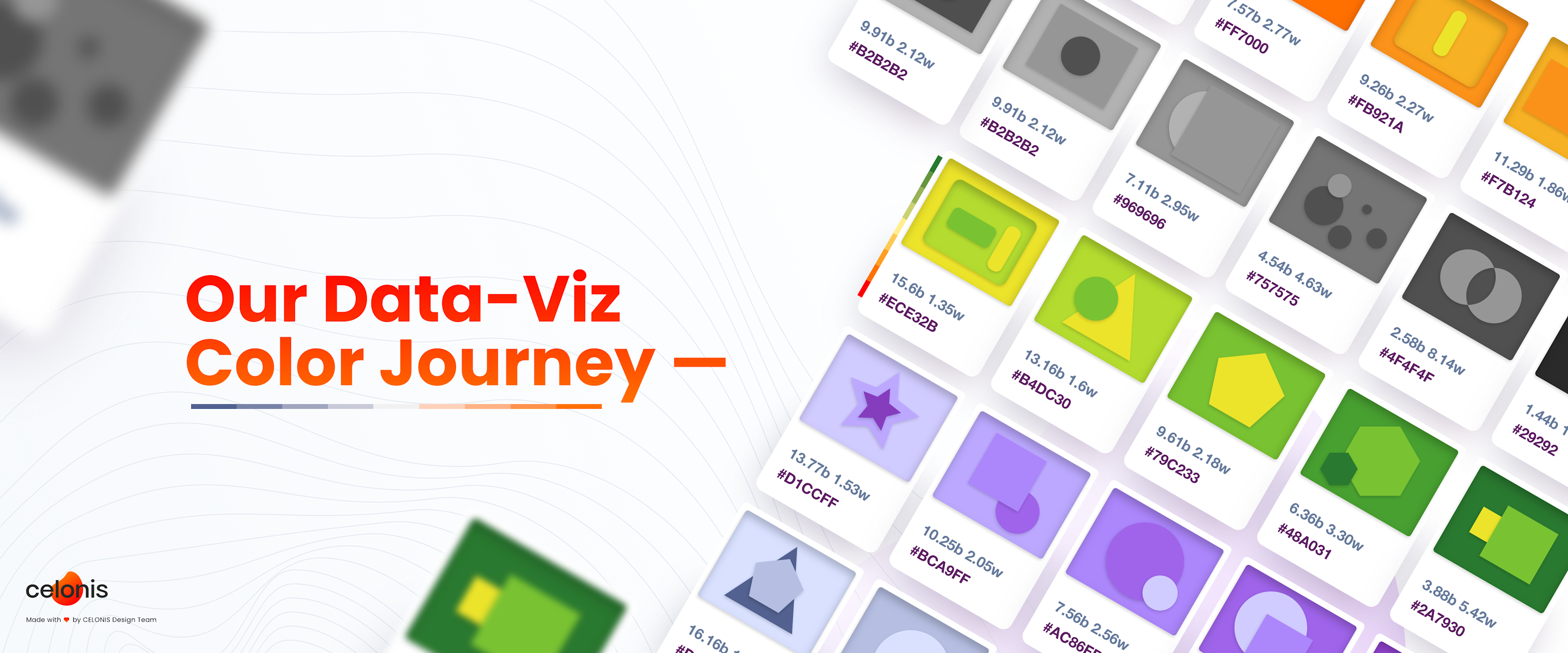
At Celonis, we recently developed a new color palette that is specifically optimized to be effective in data visualizations while still harmonizing with the company’s brand identity. In this article, we will share our new color palettes and the considerations we took on our journey.
Three Types of Color Schemes for Data Visualization
In data visualization, there are three types of color schemes: distinctive colors, sequential color scales and diverging color scales. Which of them should be used depends on the nature of the represented data.
Distinctive Colors
Distinctive colors (eg. green, blue, purple, orange — also called “color hues”) are used for categorical data, eg. political parties or energy sources. These colors strongly differ in their hues. As Lisa C. Rost puts it, these colors scream: “I am by myself and I have nothing to do with all these other colors here!”
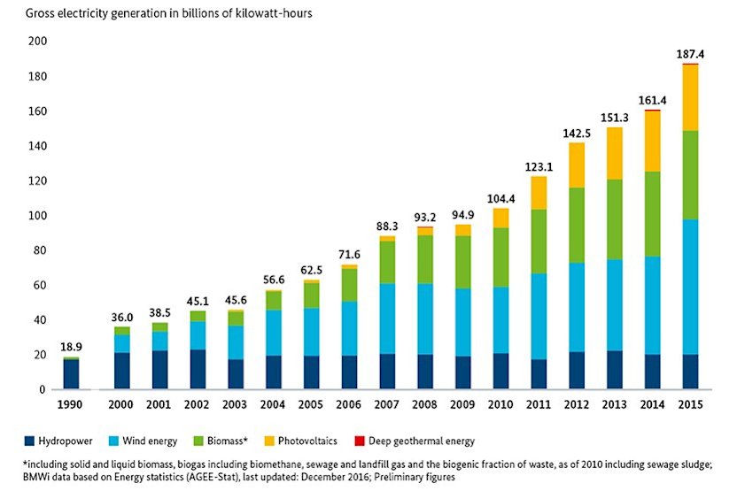
Example use case for distinctive colors for categorical data: Development of electricity generation from renewables in Germany. (from bmwi.de)
Sequential color scales
Sequential color scales are color gradients consisting of different lightness shades from light to dark. They are used to represent continuous data such as numbers ranging from low to high values, eg. population in a map. As Lisa C. Rost writes, each color in a sequential color scale tells you: “I represent a value that is a bit higher or lower than the color next to me.”
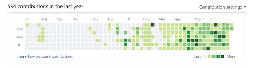
Example use case for a sequential color scale: Code contributions graph in Github. (from github.com)
Diverging color scales
Diverging color scales are also color gradients with different lightness shades. They range from a dark hue via a neutral light hue to another dark hue. These scales are used for bipolar data that varies from a meaningful mid-point such as temperatures. That is, the data ranges from one extreme (cold temperatures, blue) via the neutral mid-point (0° C, light grey) to an opposing extreme (hot temperatures, red).
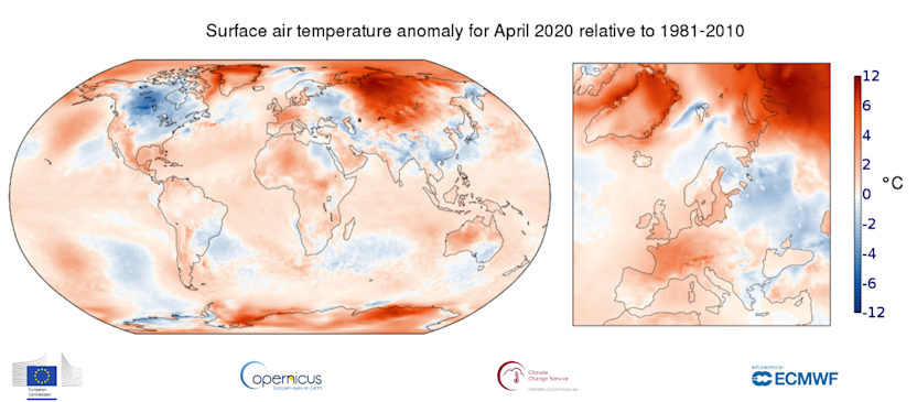
Example use case for a diverging color scale: Surface air temperatures compared to overall average of 1981–2010. (from climate.copernicus.eu)
Towards Data Visualization Colors that match Celonis Brand Identity
To achieve a recognizable and pleasant look and feel across the user interface of the Celonis Intelligent Business Cloud (IBC), we need to pick color schemes that harmonize with the colors of the overall UI and the Celonis brand. At the same time we need to optimize the colors for use in data visualizations. Thus, besides visual appeal and brand-fit, we especially consider the following data visualization criteria when picking colors:
color distinctness (how easy can people discriminate the colors?)
color deficiencies (can colorblind people distinguish the colors?)
name uniqueness (can I give all colors of the palette a different name?)
In the following, we describe our journey of creating the three different types of color schemes for data visualization with the above considerations in mind.
1: Distinctive Colors for Categorical Data
To make sure that the colors harmonize with the brand, we started by choosing some of our superfluid brand colors as known from the IBC as our initial set of distinctive colors. From there, we iteratively adjusted one color at a time to optimize for the data visualization criteria listed above.
When creating a palette of distinctive colors for categorical data, our main concern is color distinctness. That means that any two colors of the palette should be easily discriminable to the human eye. If two of the colors are too similar, it is difficult to understand which data point falls into which category. Therefore it is good practice to give each of the distinctive colors enough space on the color wheel.
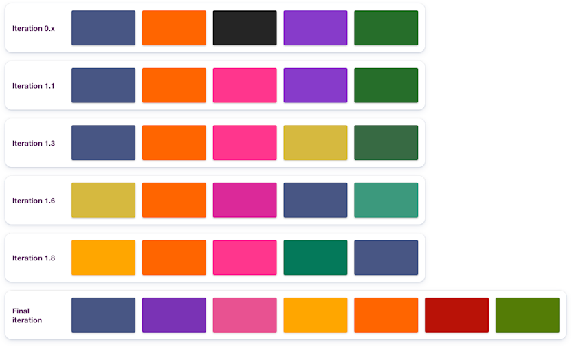
Some iterations of the distinctive colors palette.
Our final result consists of five main distinctive colors — yellow, orange, pink, purple, and blue — which are well distinguishable, color-blind safe, and match the superfluid brand of Celonis. These colors can be used to represent categorical data such as political parties, countries or companies. Additionally we added red and green as optional colors for use cases where such a signal color is needed. Since red and green are hard to discriminate for colorblind people, we advise to add other symbolic clues besides color to signal important information.
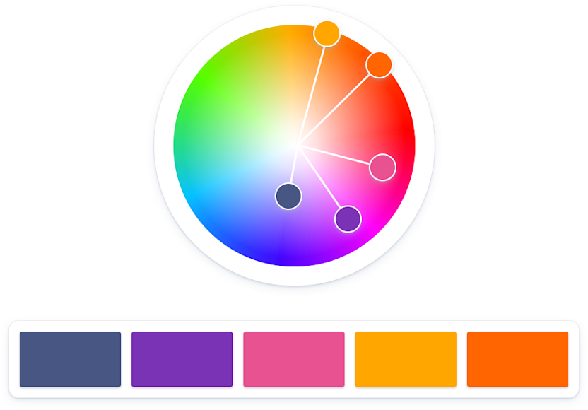
The five main distinctive colors of the final version in context of the color wheel.
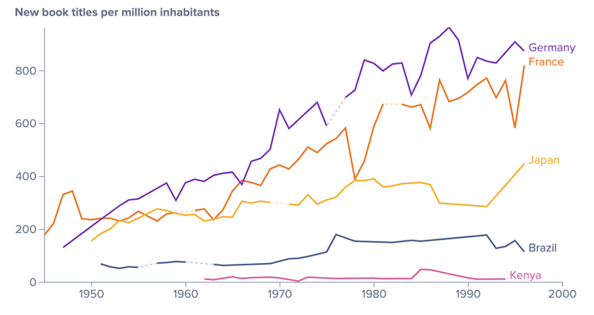
Example chart using the new distinctive colors.
2: Sequential Color Scales for Continuous Data
Data with a continuous range such as numbers is typically represented by sequential color scales. These take advantage of a phenomenon of perceptual psychology which is that humans associate darker colors with density and density with greater numbers. For this reason, large data values are represented by a dark color and smaller values by a light color. Readers will instantly understand: the lighter the color the smaller the underlying data value.
When creating a color gradient for a sequential color scale, we need to make sure that the lightness difference between the color steps is large enough. This is important so readers can clearly differentiate between adjacent colors on the scale, eg. light blue and … lighter blue. The bigger the (lightness) difference between the two extremes of the scale, the more effective the use of color. And, of course, the color steps in between should be evenly spread across the scale (“visual equidistance”).
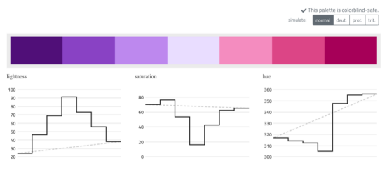
We derived six sequential color scales from all distinctive colors: blue, purple, pink, yellow, orange/red, and green. All of the sequential scales are colorblind-safe and have equally spaced lightness steps.
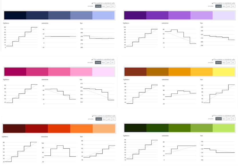
Sequential color scales derived from the distinctive colors defined above.
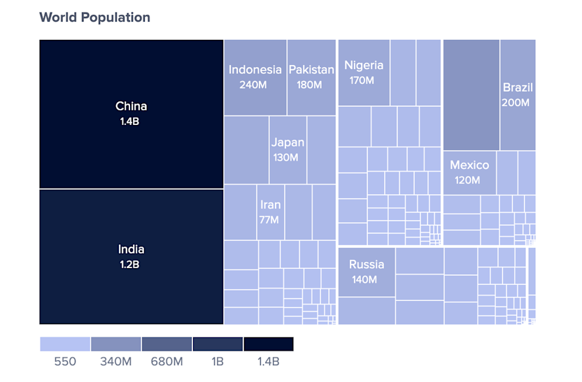
Example chart using the sequential blue color scale.
3: Diverging Color Scales for Bipolar Data
Similar to sequential scales, diverging color scales are also color gradients used to represent numbers, only that in this case we have a meaningful mid-point. To be effective in creating a diverging color scale, we can think of it as two sequential color scales that share a low value. This will be the neutral midpoint. A popular example are US electoral maps showing “how republican or democratic each state is” using a blue-red diverging scale (e.g. on fivethirtyeight.com).
When creating a diverging color scale, visual equidistance still matters as you may have guessed. In this case, it is important to pick two endpoint colors that have the same visual distance from the midpoint, especially in terms of lightness.
We created two diverging color scales that reuse parts of the above sequential scales. Both scales are colorblind-safe and have equal (or similar) lightness steps on both sides of the midpoint color.
Default diverging color scale ranging from blue to orange and one alternative scale ranging from purple to pink.
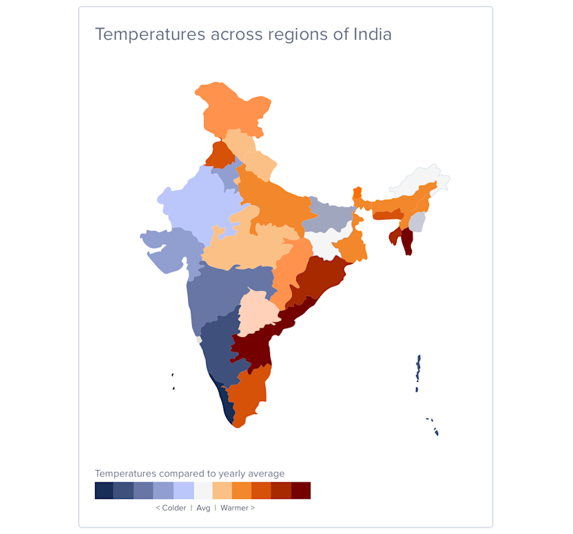
Example map using the default diverging color scale.
Additionally, we created a red to green diverging color scale as it is often used to signal good vs. bad. However, we advise to not rely solely on this color scale to communicate important information, as it is not colorblind-safe. To still convey the correct information, we suggest to add labels or other visual means to clarify the meaning of your data.
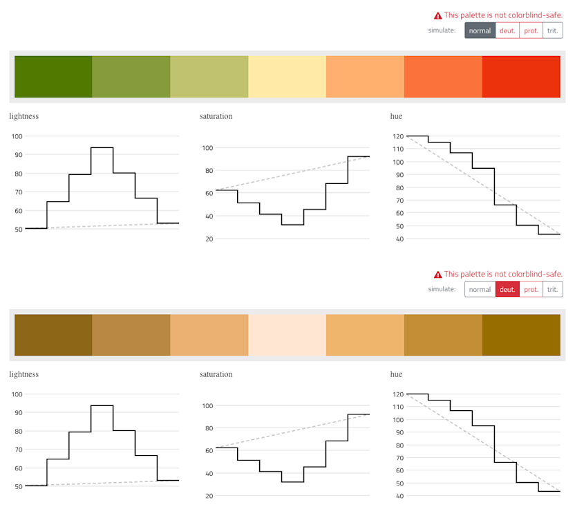
Additional diverging color scale ranging from green to red. Note, these colors are not colorblind-safe as can be seen in the bottom half of this picture which simulates the color scale as seen by a person with deuteranopia.
All the New Colors
Below you see a summary of the new Celonis color palette for data visualizations. We are excited to see the new data visualization colors in action in the IBC and we are looking forward to your feedback!
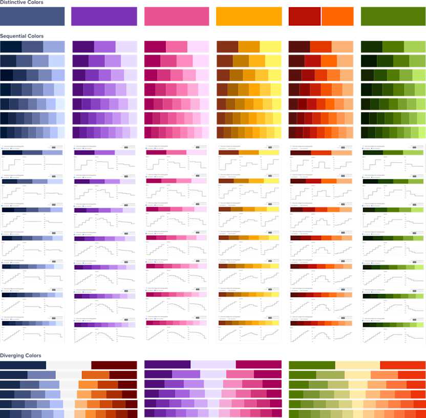
All color scales of the new Data Visualization Color Palette in one view.
Sources and Recommended Reading
This article describes a joint project of the Engineering and Design Team at Celonis. Soon you will see these colors shine in the new operational apps of Celonis. Credits for illustrations go to Joan Sterjo.

More blog posts on Celonis Engineering Blog
